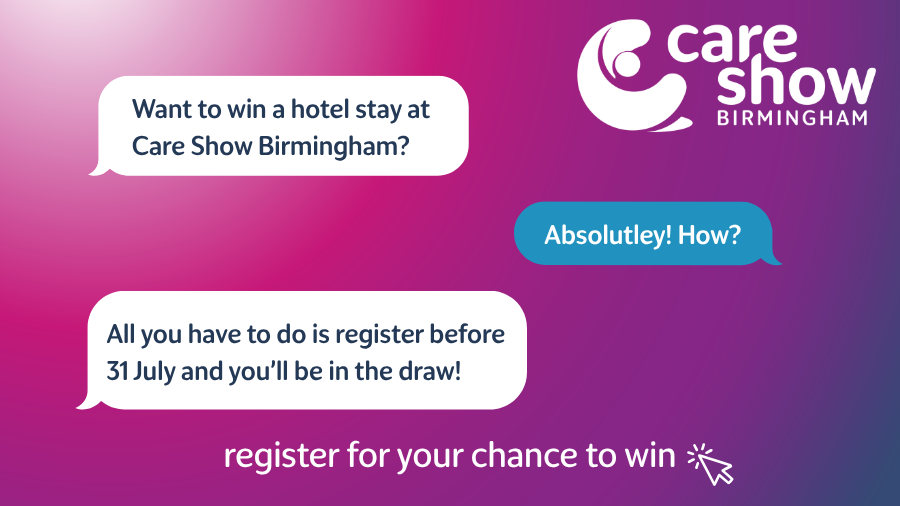

Discover Care Show's bold new look – watch the rebrand video now!
For over a decade, Care Show has brought the care community together under one roof, celebrating your dedication and driving the future of care.
We’ve built the show by listening, learning, and putting people first. As the care sector transforms, we’re embracing that change with a bold new focus and an energised team dedicated to creating a conference where owners and carers can learn, grow and improve the care they provide.
Now, we have decided to refresh our brand. But this isn’t just a new look, it’s a renewed commitment to the people who make care extraordinary.
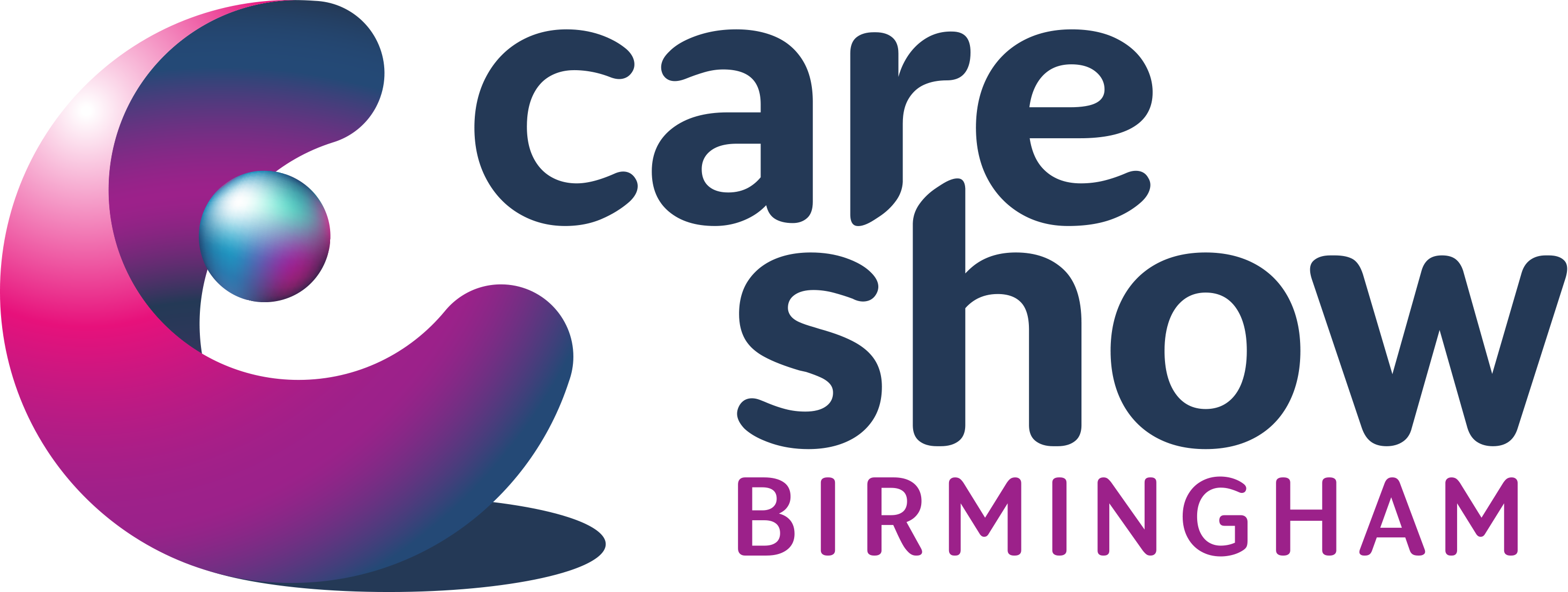
the logo
In a sector that’s always evolving, our new logo reflects Care Show’s core spirit. The icon suggests an embrace, with flowing curves that carry the same sense of comfort and connection you’ve always known. We’ve also chosen lowercase lettering to give the brand a friendly, modern, and approachable look.
backstory
Care Show launched over 20 years ago with one simple mission, to bring the care community together.
Now the mission has grown into something bigger – to create the UK’s main social care event in the calendar, with shows in Birmingham and London. We welcome over 14,000 working within social care, representing 8,000 different care providers, from domiciliary care, to nursing homes, from respite care and more recently retirement living.
But with that growth, something else has become clear. It’s time our look reflects who we’ve become.

It was time for Care Show to step confidently into a new chapter, future-proofing the brand so it remains strong for years to come. It’s still the Care Show you know and love, now with a refreshed visual identity that feels unmistakably us.
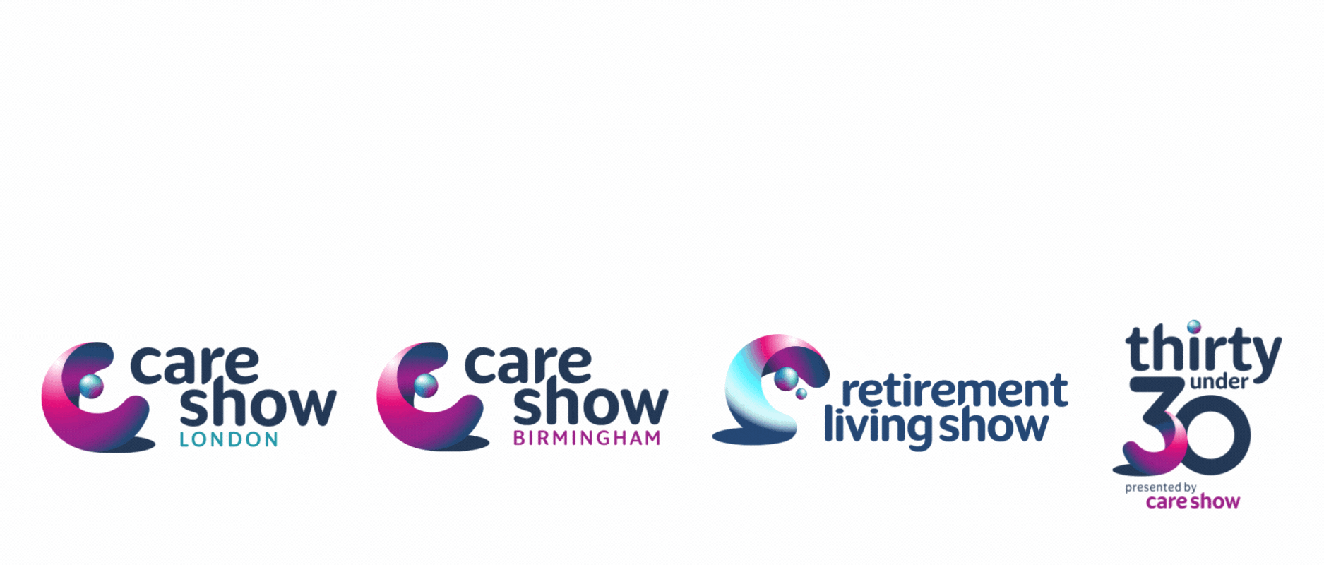
This new look unites every event, Care Show Birmingham, Care Show London, Retirement Living Show, and Care Show Thirty Under 30, under one cohesive brand.
Our refreshed identity captures the warmth, personality, and community spirit that define Care Show and the amazing people who bring it to life.
tone of voice
The new Care Show tone of voice is warm and clear, proudly grounded in our role as the UK’s leading care event. We want everyone to feel a part of the conversation and so our language is friendly and inclusive.
Our tone reflects our brand values and what we stand for.
We’re not afraid to think outside of the box or bring playful energy to our tone, because driving better care should feel exciting, hopeful and something we can all get behind.


colour
We’ve refreshed our colour palette while keeping the familiar tones, ensuring we don’t lose the vibrancy that defines the event. A bold new blue now anchors the Care Show branding, supported by a range of other shades to add depth. You’ll also see colour gradients featured throughout - layers that overlap and blend, reflecting our goal of bringing the entire care sector together under one roof.